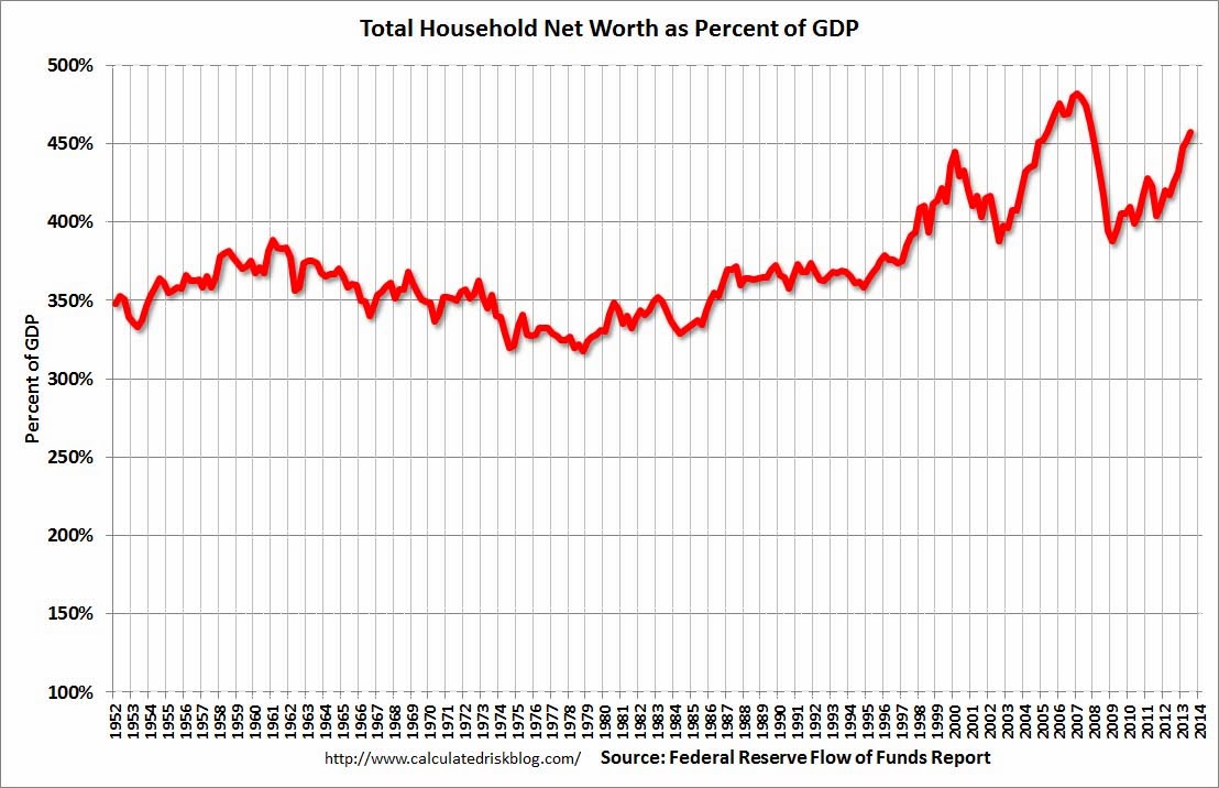
This graph represents the household net worth of the U.S. as a percent of GDP at the end of Q3 2013. I have been fascinated by this graph since I first saw it at the end of 1999, and I am going dissect it in a couple of parts in the next few posts.
As a skeptic of technology shares and the value of the equity market in 1999, I spent quite a bit of time thinking about this graph.The first thing that jumps out at you is the long period of time that the valuation of HHNW/GDP spent in the 350% range. The first time I saw someone use this valuation metric he was trying to say (in 1999) that HHNW was 100% above its long term average and that he thought asset values could fall by $10 trillion, which was the GDP figure at the time.
As someone who was bearish, the idea of accepting that conclusion and moving on was tempting, but I wanted to know why 350% had been, for so long, where HHNW/GDP had settled. Perhaps 350% was too low. Maybe 450% was too low. The analyst using the graph as something to back up his own bearish bias was just assuming that the past numbers were correct, but were they?
Let's apply a little a priori logic here and try and work backwards.What is it that drives real wealth in a society? How does HHNW increase? The answer is pretty simple, savings plus real increases in output are what allow a society to increase its wealth. So, we can express the numerator of the quotient as:
(Savings Rate + Real GDP Growth Rate)
The final step would be to divide this sum by the real GDP growth rate to come up with the rough calculation for where HHNW/GDP would max out over time.
In looking at the data for the 1950s and 1960s, the savings rate was approximately 10% of GDP and real GDP growth averaged nearly 4% over the two decades. Using the above formula we see that:
(.10+.04)/.04 = 3.5
There seems to be some logic behind the 350% number.
In the 1970s, the savings rate started to fall post the abandonment of Bretton-Woods and the tying of the dollar to gold (a topic for another time) as did the real growth rate. The savings rate averaged about 8% and real growth fell closer to 3%. These numbers would see HHNW/GDP grow to a theoretical maximum of 367% over time. So far so good.
Looked at another way, what this tells us is that through the 1970s, increases in HHNW over time were backed up by incremental real output and real savings. There were real goods and services backing up the assets used in calculating HHNW. This is as it should be since assets like stocks, bonds, home equity and bank deposits represent a potential claim on other goods and services.
This all began to change in the 1980s, and not in a good way.
This
The Fed estimated that the value of household real estate increa
Read more at http://www.calculatedriskblog.com/2013/12/feds-q3-flow-of-funds-household.html#klW6ZX723hwOQziX.99
The Fed estimated that the value of household real estate increaRead more at http://www.calculatedriskblog.com/2013/12/feds-q3-flow-of-funds-household.html#klW6ZX723hwOQziX.99
Read more at http://www.calculatedriskblog.com/2013/12/feds-q3-flow-of-funds-household.html#klW6ZX723hwOQziX.99
 Click on graph for larger image.
This is the Households and Nonprofit net worth as a percent of GDP. Although household net worth is at a record high, as a percent of GDP it is still below the peaks in 2000 (stock bubble) and 2006 (housing bubble).
This includes real estate and financial assets (stocks, bonds, pension reserves, deposits, etc) net
Read more at http://www.calculatedriskblog.com/2013/12/feds-q3-flow-of-funds-household.html#klW6ZX723hwOQziX
No comments:
Post a Comment